Emerald Code
Emerald Code is a YouTube show aimed at teenage girls interested in STEM. They planned a rebrand to co-occur with the launch of a new character in season two.
The client wanted bold and exciting patterns to support Emerald’s Code content with the redesign of the logo to pair with the brand concept. Bright colours would encourage students, parents and teachers to learn more about STEM subjects and use them throughout the website. Vibrant colours and white spaces stimulate the user to the content. A mixture of geometric and organic shapes/patterns to support the design and reference old notebooks with stickers and handmade doodles.
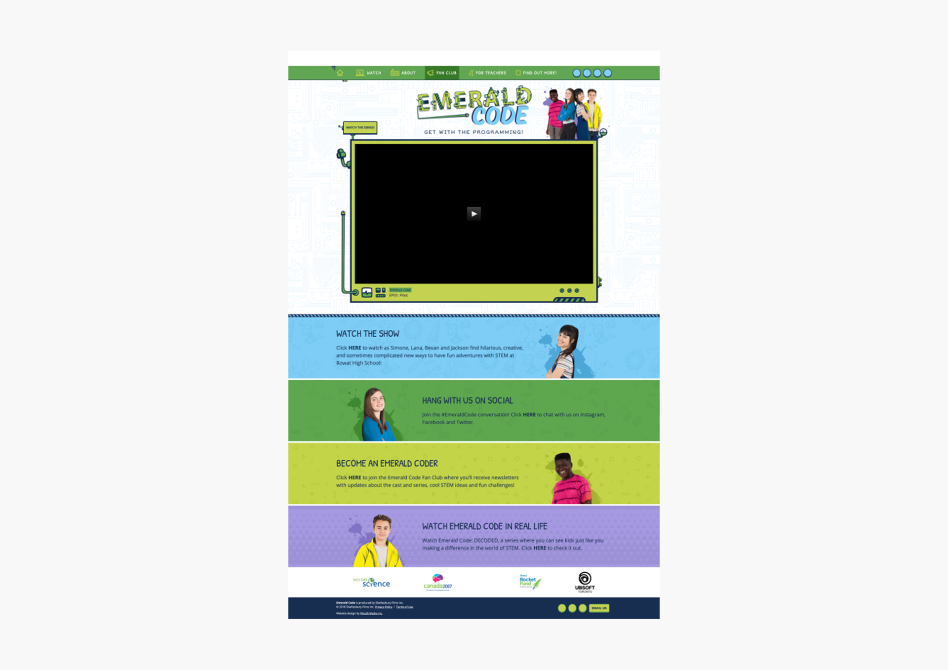
Old branding and interface
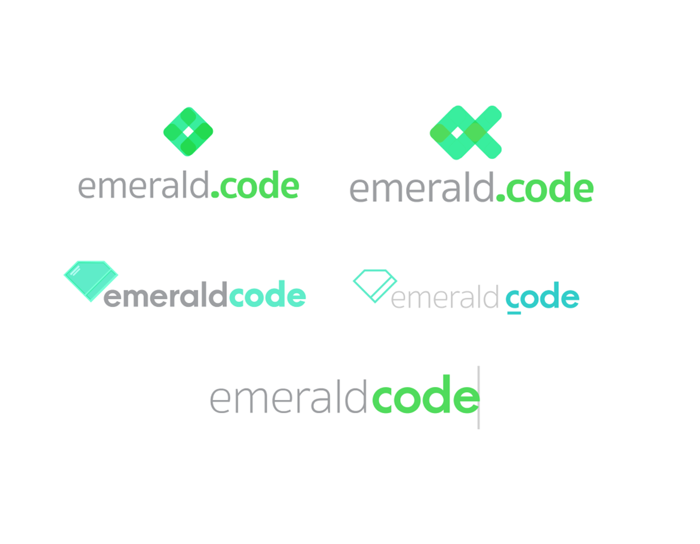
Proposed logos
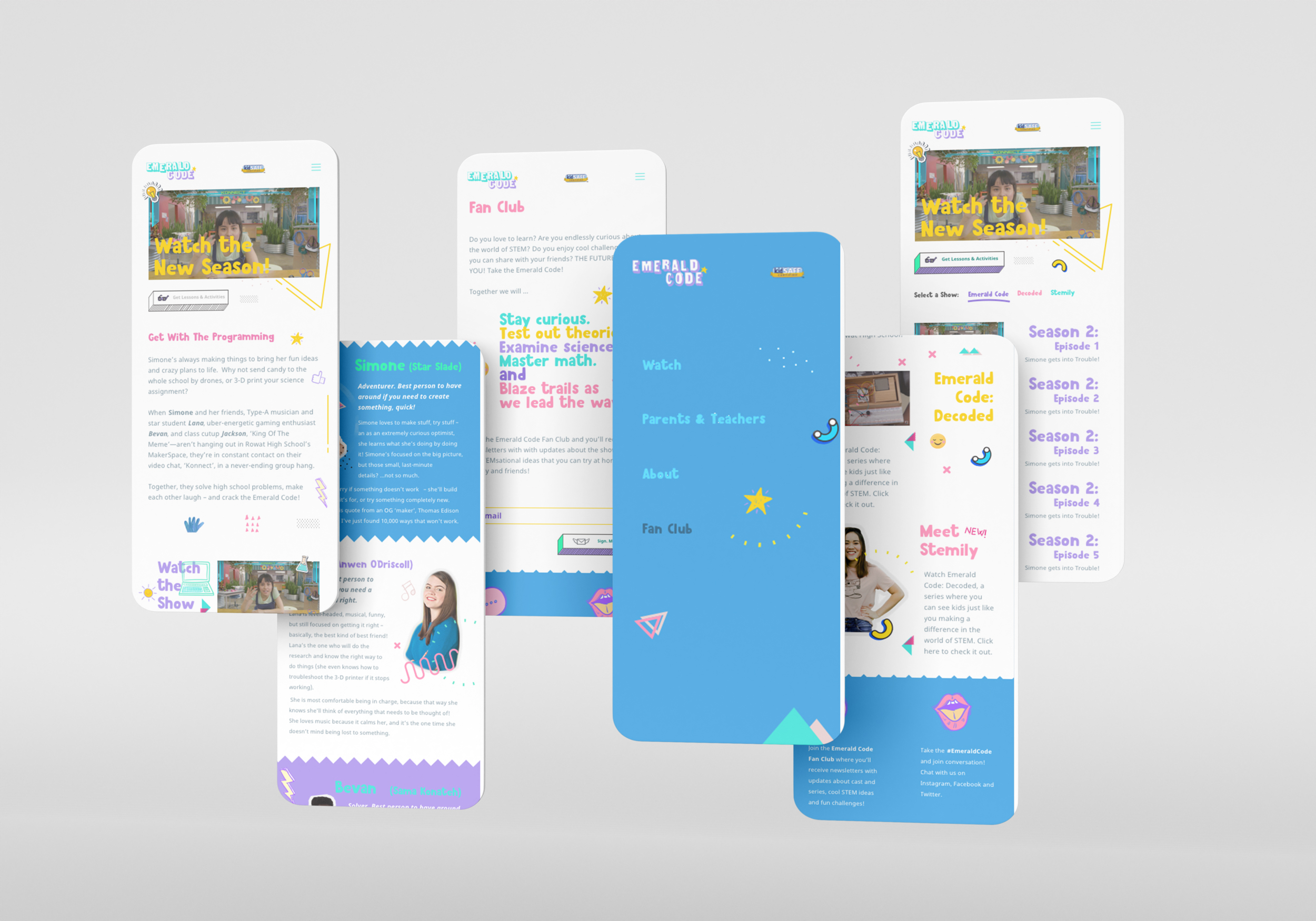
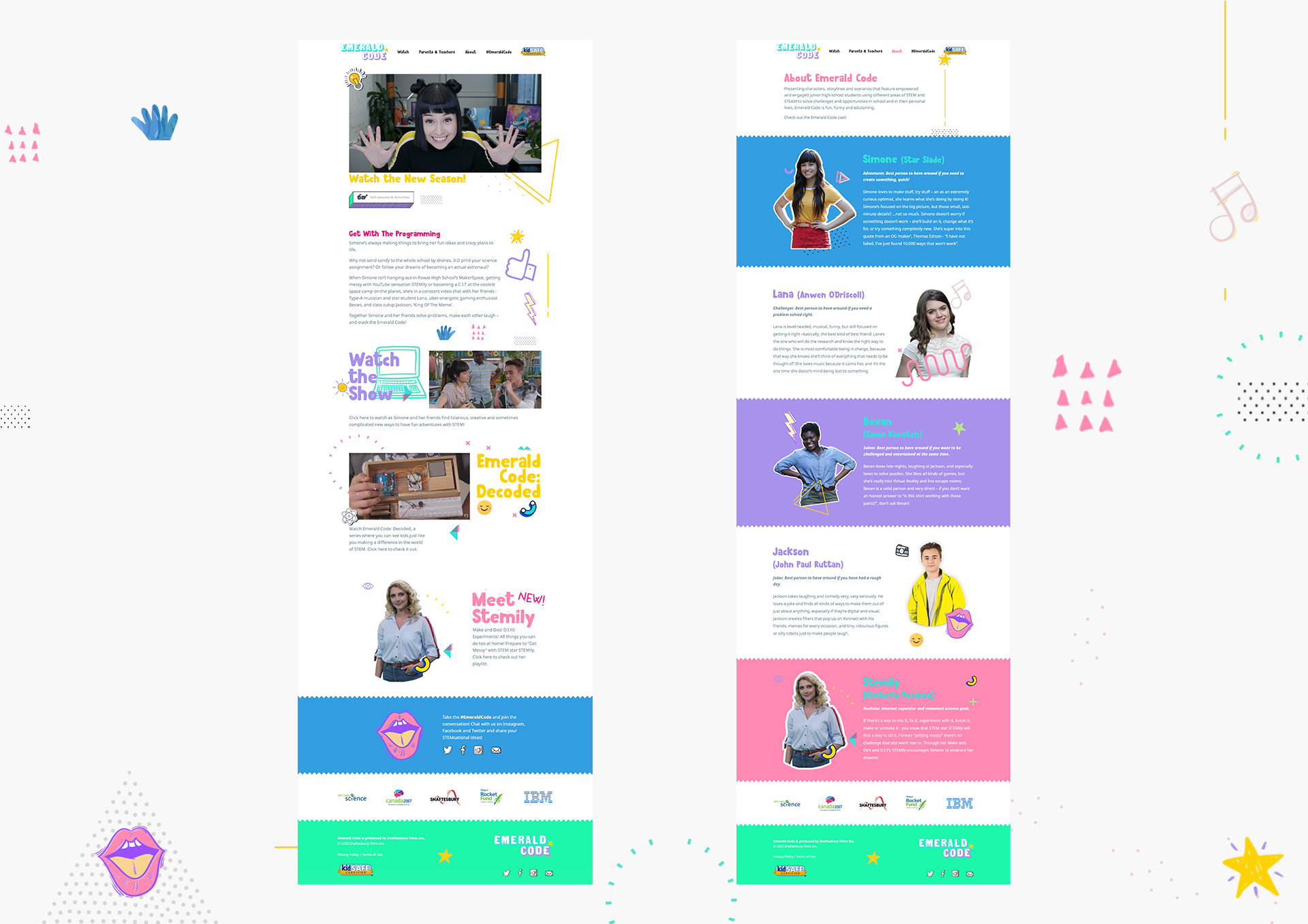
The doodles were applied to resemble a notepad and support the website's vision, while leaving enough white space to avoid conflicting with the information. Examples of visuals applied to the website and branding.
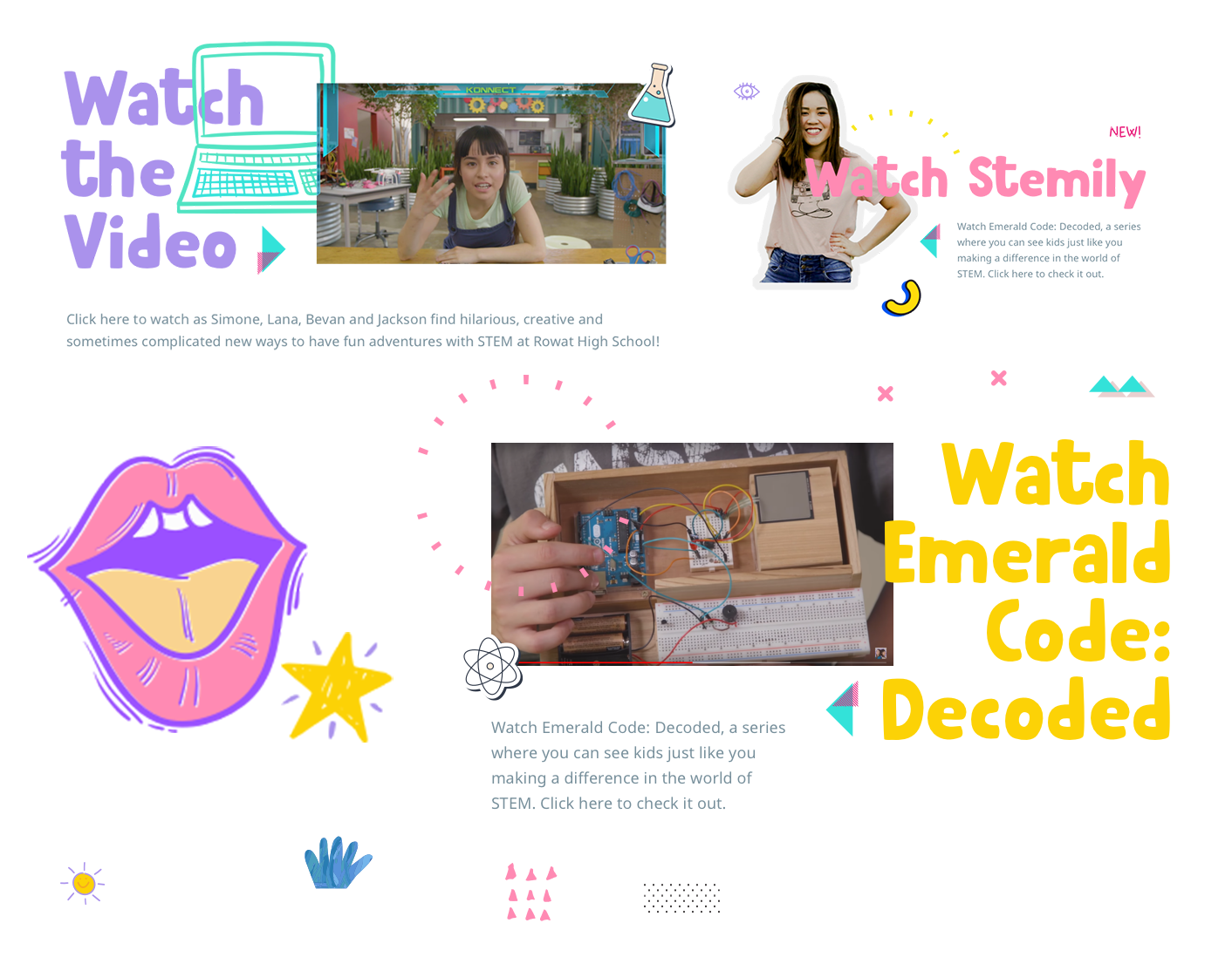
The UI came through resembling notebooks/scrapbooks from teenagers to support the target audience and create an accessible/known world to them.
https://emeraldcode.ca
https://emeraldcode.ca