Blu Ivy
Blu Ivy is an employer branding specialist that supports employer brands and provides them with bespoke strategies to communicate and manage the companies. They needed a new website to resemble the new branding.
BluIvy has gone through a rebranding process, resulting in a new mission emphasizing collaboration, diversity, and teamwork. The company focused on working together, using shapes like circles to represent unity and perfection and rectangles to merge the company's needs and BluIvy's.
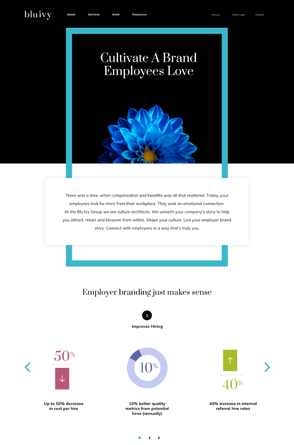
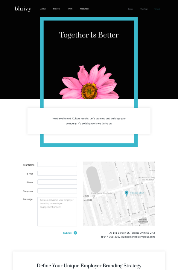
The new design system aimed to showcase the rebranding as much as possible, incorporating circles into the website design as a playful brand representation. Additionally, bright colours are used to complement the primary blue colour of the design system, much like flowers in a garden.
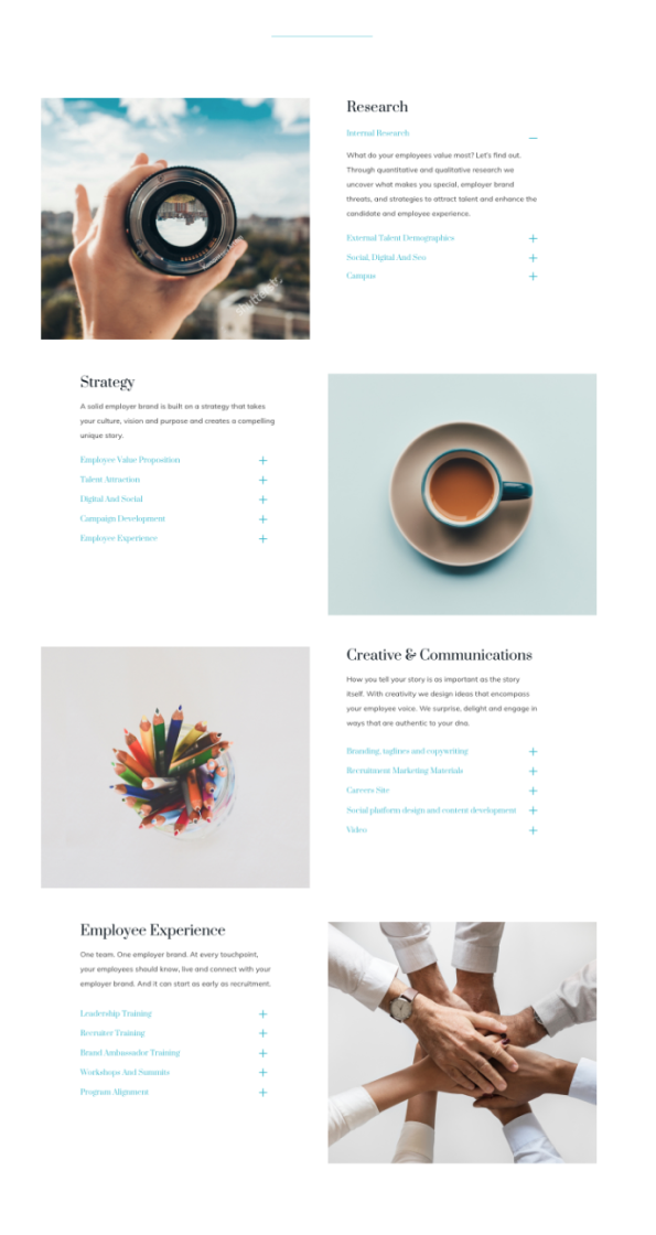
Due to the volume of information and the tight deadline (up to 4 weeks to go live), the solution for this project was to create a modular website with elements that would enhance the content, white spaces to give the eye some "rest" and visuals that would complement the clean aesthetic as well.
The landing page is designed to showcase the floral and blue ornament featured throughout the website.
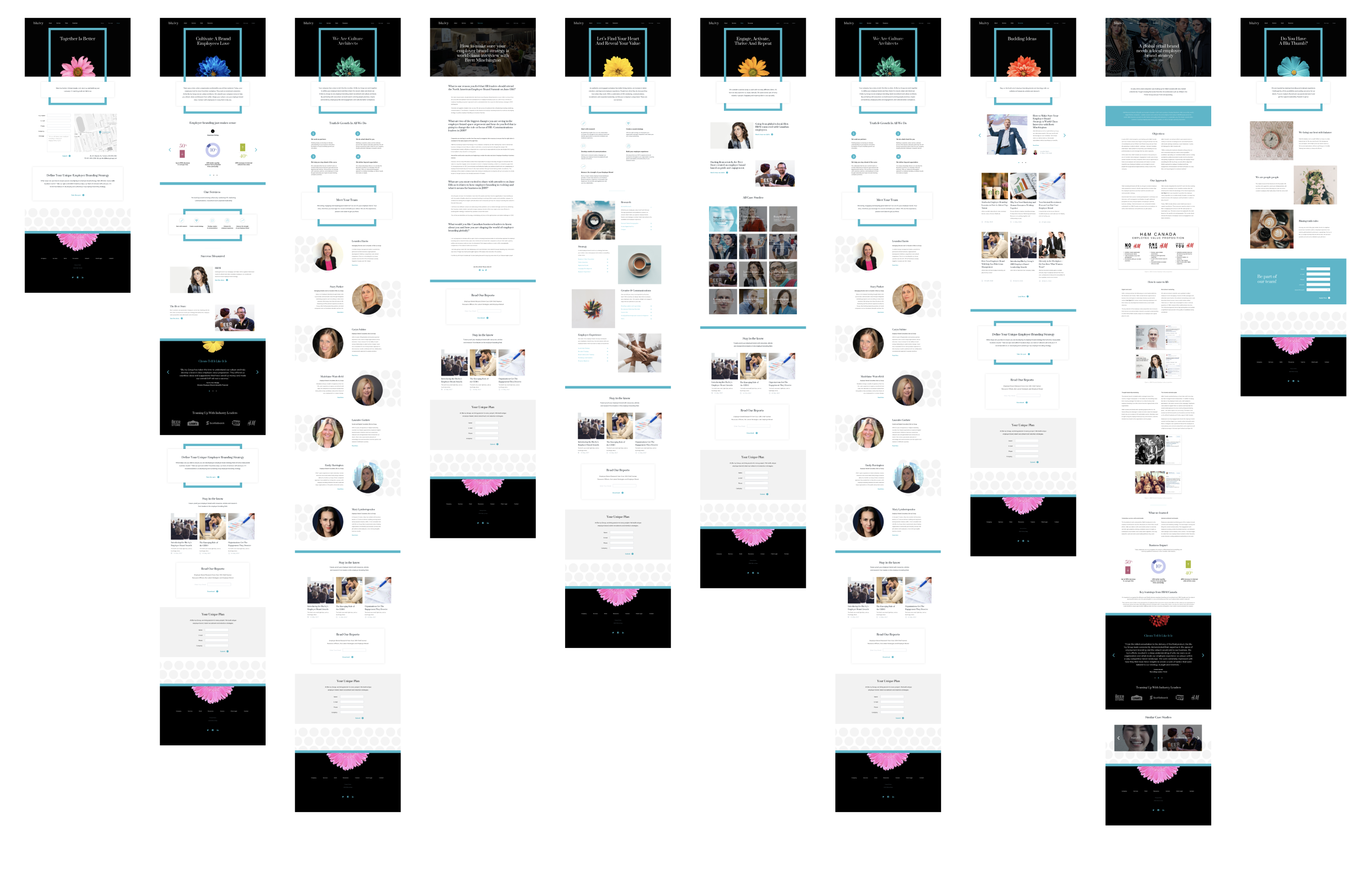
The hero image prominently displays the flowers, while circular supporting images maintain a cohesive design system. Even in the mobile menu version, the flower is prominently displayed to maintain consistency across all platforms.